
Our work
See the purpose
in the details.
Every site we build starts with the church’s own story, people, and calling. Here is a recent one, plus the thinking behind our own brand.
The Ingathering
Church website / Suffolk, Virginia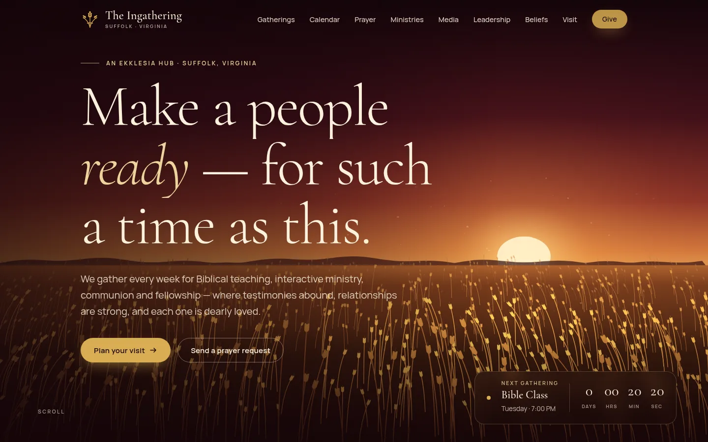
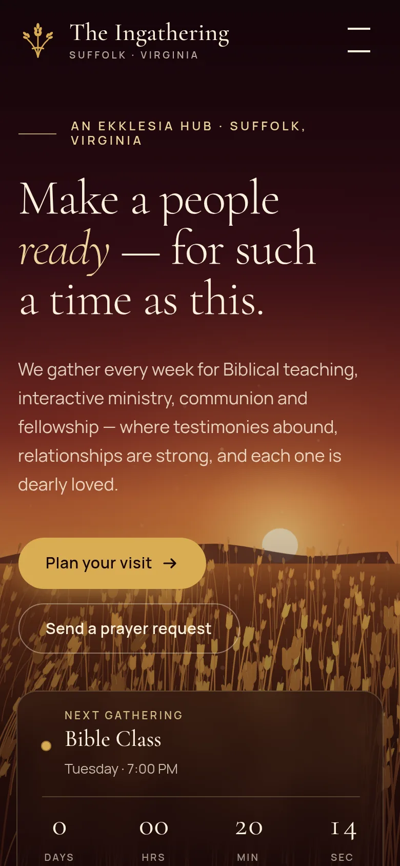
The Ingathering’s name comes from the harvest, so the site opens on a golden wheat field at sunset, drawn in code so it moves gently and loads fast on any phone.
We gathered every page, photo, and message from their old site, kept what mattered, and gave it a clear path: plan a visit, pray, connect, give.
Made for their people
Built to be used every week.
- A live countdown to the next gathering
- A prayer request form and a regional prayer map
- Prophecies, articles, and declarations they publish themselves
- A simple editor for their calendar and photos, no tech skills needed
Faith Creative
Brand concept / Web experience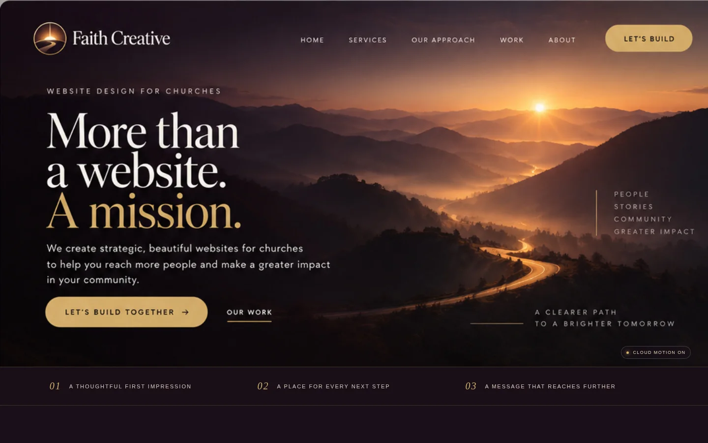
The idea
A clearer path to a brighter tomorrow.
The landscape carries the message: a road moving toward light. Warm ivory typography brings clarity, while restrained gold draws attention to the next step.
The design preserves the photographic composition, gives the sunrise room to breathe, and places the invitation where visitors can find it.
Made for people
Beauty that has a job to do.
- A readable message and clear invitation
- A mobile composition with its own rhythm
- Keyboard-friendly navigation
- Reduced-motion and photographic fallbacks
A clearer path forward